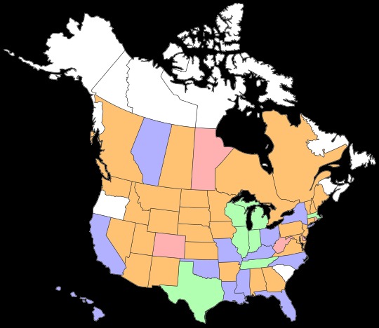
The following is an exercise in self-absorption. But then, what’s a blog for? Recently I chanced across a site that would generate color-coded maps not just of states and provinces you’ve visited, but rank them with a five-color scheme (counting no color). The site of origin is the not-very-often-updated defocus-blog.
 I’m changing defocus-blog’s suggested definitions of the colors a little to suit myself.
Green: either lived in these places or visited so many times I’ve lost count. Very familiar.
Blue: Numerous visits covering a fair amount of the state or province, or one or two visits of strong intensity and some variety. Fairly familiar.
Orange: Spent the night at least once, saw a relatively limited number of places.
Pink: Passed through (on the ground) but didn’t spend the night.
White (no color): Never visited.
The difference between orange and blue is sometimes a little hazy. For instance, I thought for a while about the color of Alabama and Georgia, places I’ve been more than once, and decided that I haven’t really seen that much of them. (I need to see Mobile and Savannah, I think, and some spots in between). The rest of New England (except for Rhode Island) could be blue, maybe, since I visited more than once — and they aren’t that big — and Louisiana might merit orange, but Louisiana has offered up some intense visits.
I don’t particularly aspire to add any more green states or provinces. But I would like to convert orange and pink to blue, and fill in those pesky white spots, which naturally are all pretty far from each other and me.