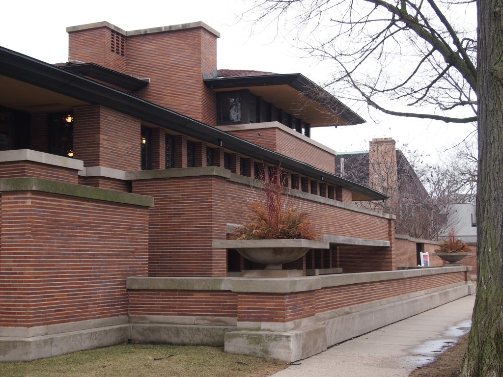
It was a little hard to get a full picture of the Frederick C. Robie House, which sits horizontally on a 60’ x 180’ lot on the South Side of Chicago. At least it’s hard if you don’t feel like backing up into the street, and I didn’t. The wind was brisk and everyone wanted to get inside.
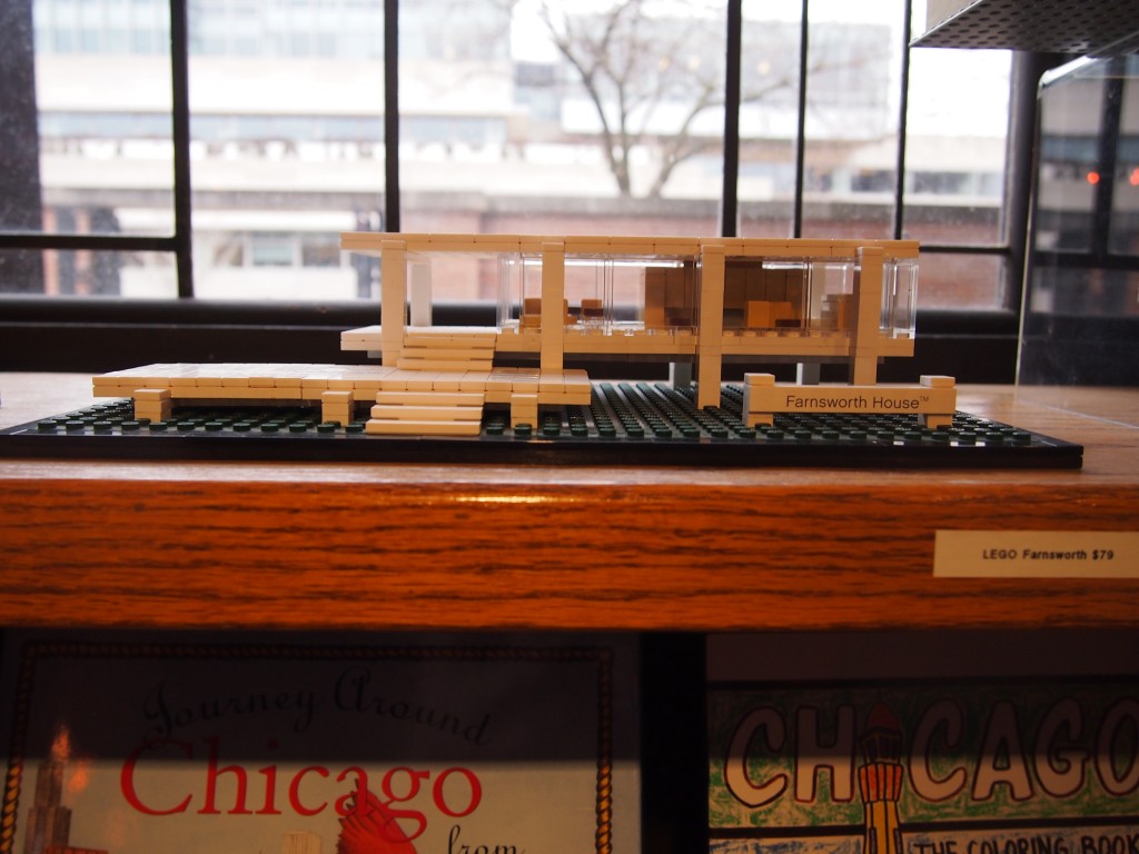
 As usual with a Frank Lloyd Wright work, it’s just as useful to think of it as a complex work of sculpture as much as a dwelling place, maybe more so. Something you might create with large, very expensive set of Legos, and which needs to be sustained with an IV money drip. The place was expensive from the get-go: the 1910 cost was about $60,000, or roughly $1.4 million in our dollars. For that price Robie got not only the lot and the house, with its long, lean lines, but also the furnishings, which were provided by the architect. And at least FLW didn’t run off with his wife.
 You pick up your tickets at the gift shop (the entrance is pictured above), a space that was originally a garage, since Robie had a fascination for early auto-mobiles, as some wealthy men of the time did. The shop is stocked with architectural-themed books, videos, clothes, games and knickknacks, many associated with FLW, but not all. It included a Lego set – see, you can build architecturally significant Chicago-area houses from Legos – that looked awfully familiar.
 The tour started in the lower level, adjacent to the gift shop-garage, which our guide called the Children’s Playroom, which is habitable but not yet restored. We saw a short video there about the house, including its bumpy history – Robie only lived there a bit more than a year before financial troubles obliged him to sell, to a guy who died shortly after moving in; later, when the Chicago Theological Seminary owned the house, it was nearly razed twice, including a 1950s threat that inspired a 90-year-old FLW to show up to protest.
But of course the building survived, and has even influenced its immediate surroundings . After the video we went outside and took a look at things from the entrance plaza of the Harper Center of the U of C’s Booth School of Business, which is across E. 58th St. The 215,000-square-foot Harper Center, completed only in 2004, references the Robie House with its horizontals and cantilevered elements (a Thornton Tomasetti design: more here).
The house’s entrance is tucked away under one of the large horizontal elements, making it hard to see from the street. The entryway is also only a few inches higher than my height, which makes me speculate that FLW wanted to make it even shorter – why should anything be taller than what he, a short man, needs? If so — and you certainly get that feeling at Taliesin sometimes — WTF, FLW?
But he wasn’t The Genius of later lore quite yet, so he didn’t win on that point. Or maybe it’s that he didn’t really see the design all the way through completion, since he skedaddled to Europe around then.
The second floor, barely visible from the outside through the seeming simple but elegant windows, is an impressive space. The great open room sports interesting glass and wood and lighting features, and I thought it would been a swell place for a swank party – during any decade from the 1920s to the 1950s, since swank was pretty much dead after that. Not sure it would be all that comfortable for daily living, not without more comfortable furniture and more clutter (comfortable for me, at least. What’s life without clutter? Drab.)
Most of the bedrooms aren’t visible on the ordinary tour because they’re on the third floor, which has only one way in or out. For a tour of a dozen or 15 people, apparently, the Chicago Fire Marshall insists on two ways out. So the third floor is accessible via small-group tours that cost more. I didn’t need to see the additional space that badly. We saw one second-floor bedroom, intended to be a guest bedroom, though at the moment it’s devoid of furnishing. I noticed in that room that the electric lights – even though brought up to code by the renovation – are operated by a two-button system, which I don’t see often.
In the not-yet-refurbished kitchen stands a conventional refrigerator, and it doesn’t go with the design at all. But mainly that’s because it stands in front of a dwarf-sized door that leads to a servants’ staircase. That door, the guide pointed out, was for the delivery of ice, and the spot where the refrigerator stands was for an icebox. I hope a little bit of our admission price goes to the purchase of a 1910-vintage ice box, because that spot cries out for one.