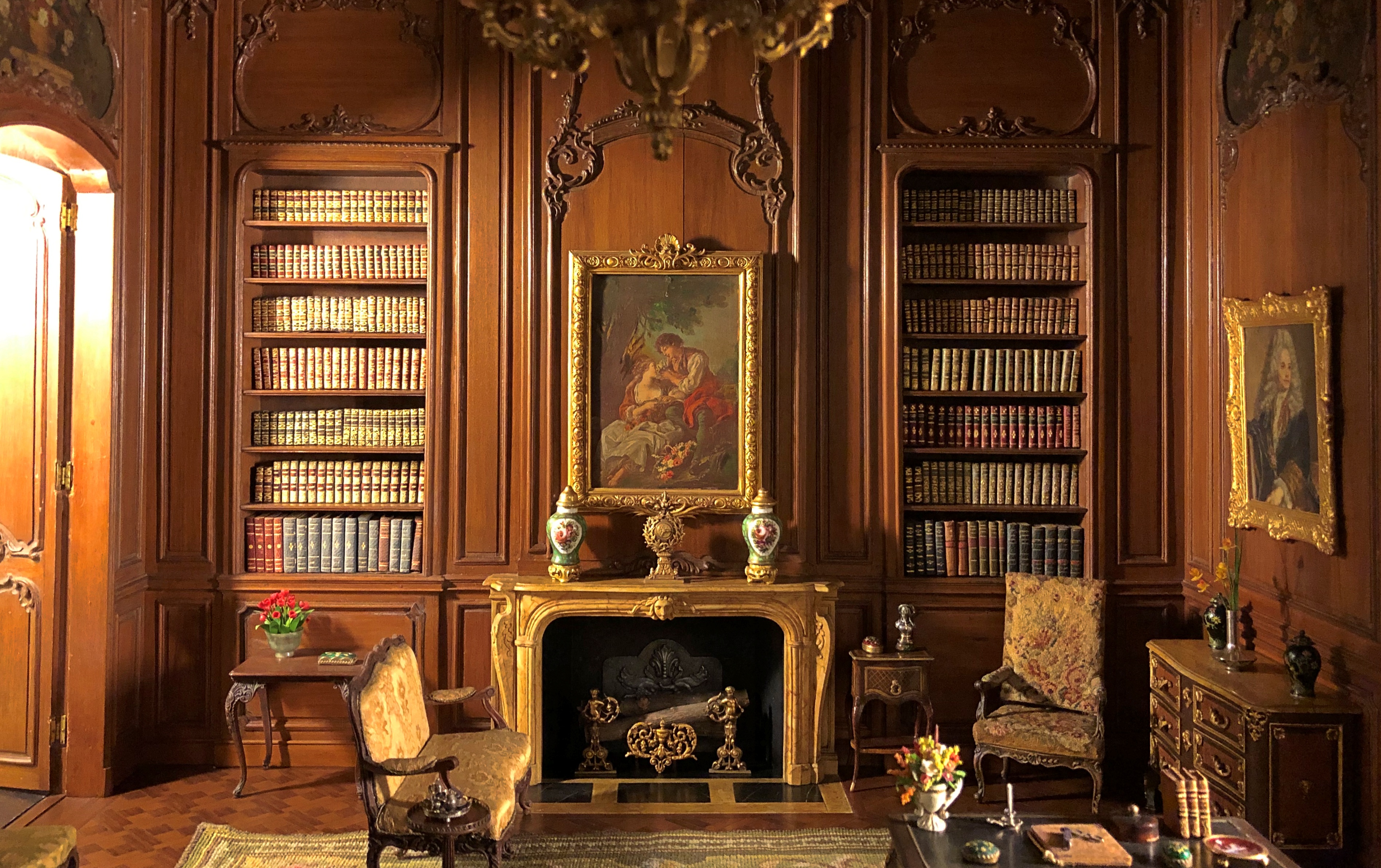
I’d like to say I visited this room recently — looks interesting, doesn’t it? — but I only looked into the room.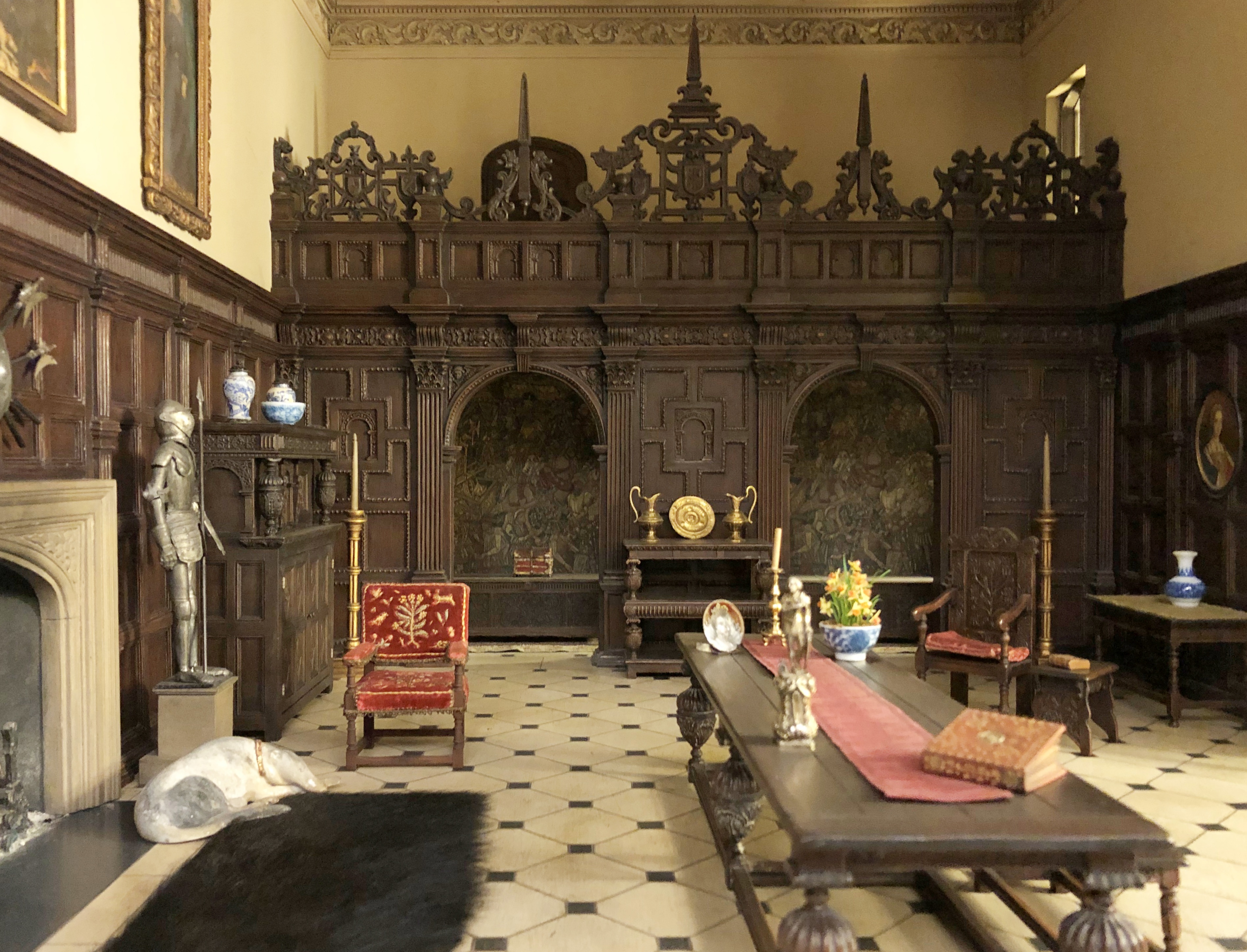
An English great room of the late Tudor period, 1550-1603, according to a nearby sign. I couldn’t get in because one inch within this room equals one foot in an actual room of that kind, so at best I could get a hand in.
The Art Institute doesn’t want anyone to do that, and for good reason, since random hands would completely wreck any of the Thorne Miniature Rooms. So they are behind glass in walled-in spaces, and not at eye level for someone as tall as I am.
Still, I leaned over to look in. The fascination is there. Not just for me, but for the many other people looking at the rooms on Saturday. Each room evokes a different place or time, heavily but not exclusively American or European settings.
English drawing room, ca. 1800.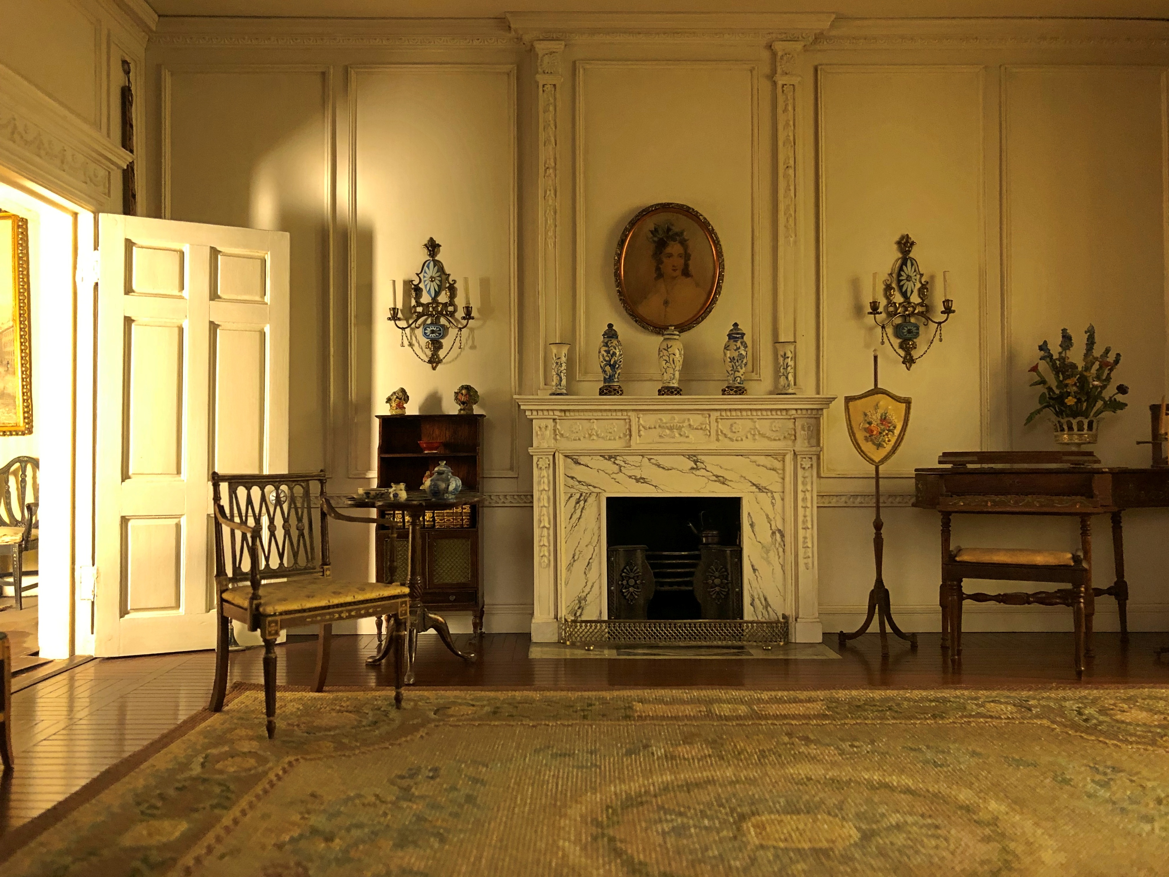
Across the Atlantic. Pennsylvania drawing room, 1830s.
Massachusetts living room, 1675-1700.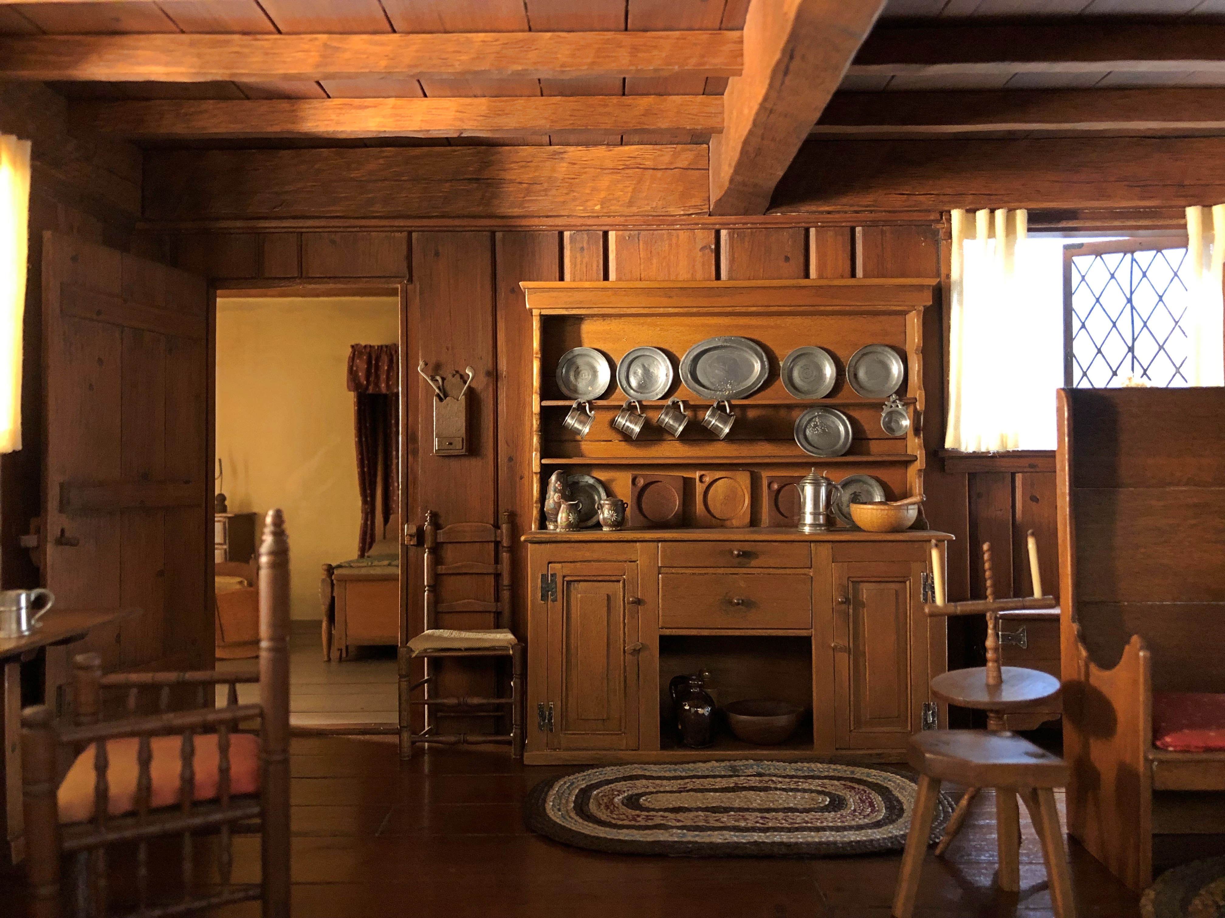
The fascination isn’t just with the astonishing intricacy of the work, which it certainly has, but also the artful lighting. Artful as the light-play on a Kubrick set. I know those are electric lights in the background, but it looks like the rooms are lighted the way they would have been during those periods. With sunlight, that is.
“Narcissa Niblack Thorne, the creator of the Thorne Rooms, herself had a vivid imagination,” says the Art Institute. “In the 1930s, she assembled a group of skilled artisans in Chicago to create a series of intricate rooms on the minute scale of 1:12.
“With these interiors, she wanted to present a visual history of interior design that was both accurate and inspiring. The result is two parts fantasy, one part history — each room a shoe box–sized stage set awaiting viewers’ characters and plots.” (More microwave oven–sized, I’d say.)
Thorne (d. 1966) had the wherewithal to hire artisans during the Depression by being married to James Ward Thorne, an heir to the Montgomery Ward department store fortune, back when department stores generated fortunes. Bet the artisans were glad to have the work.
It wasn’t my first visit to the Thorne Rooms, but I believe I appreciate it a little more each time. I know I feel that way about the Chicago Stock Exchange Trading Room, which I also visited on Saturday.
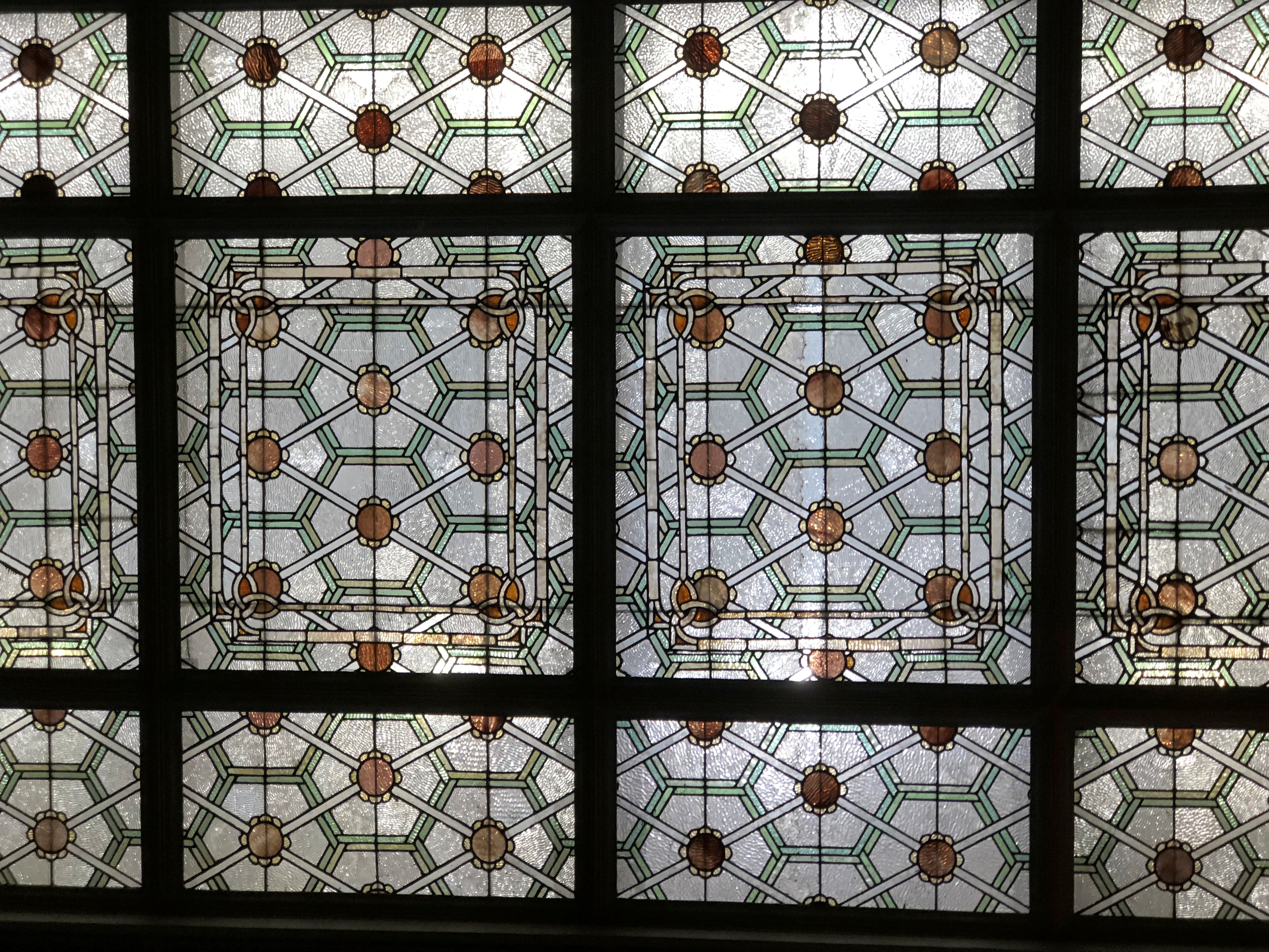
The Thorne Rooms are an exercise in constrained space. The Trading Room is one of expansive space. So much so that my basic lens really isn’t up to capturing the whole. Still, I try.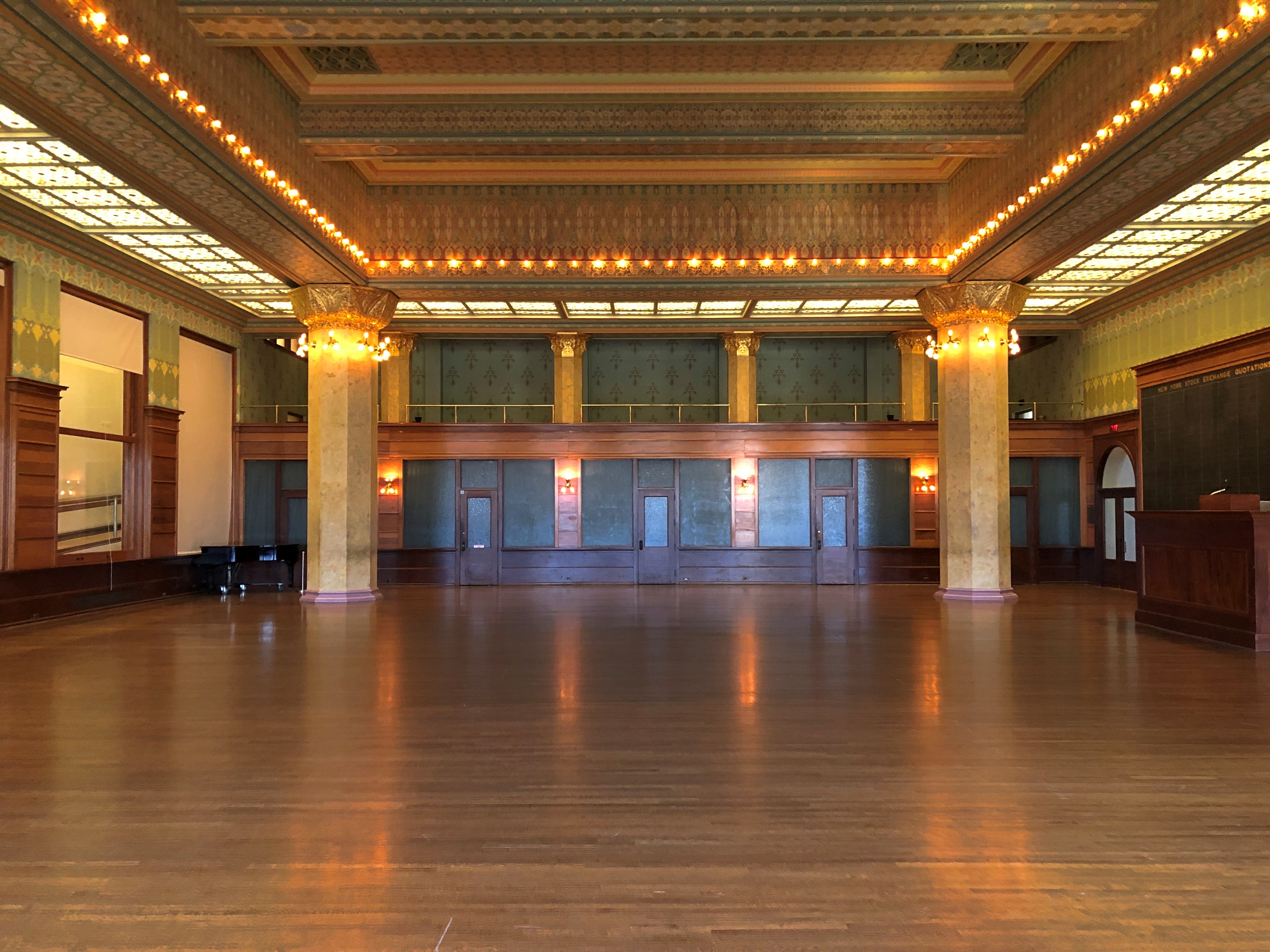
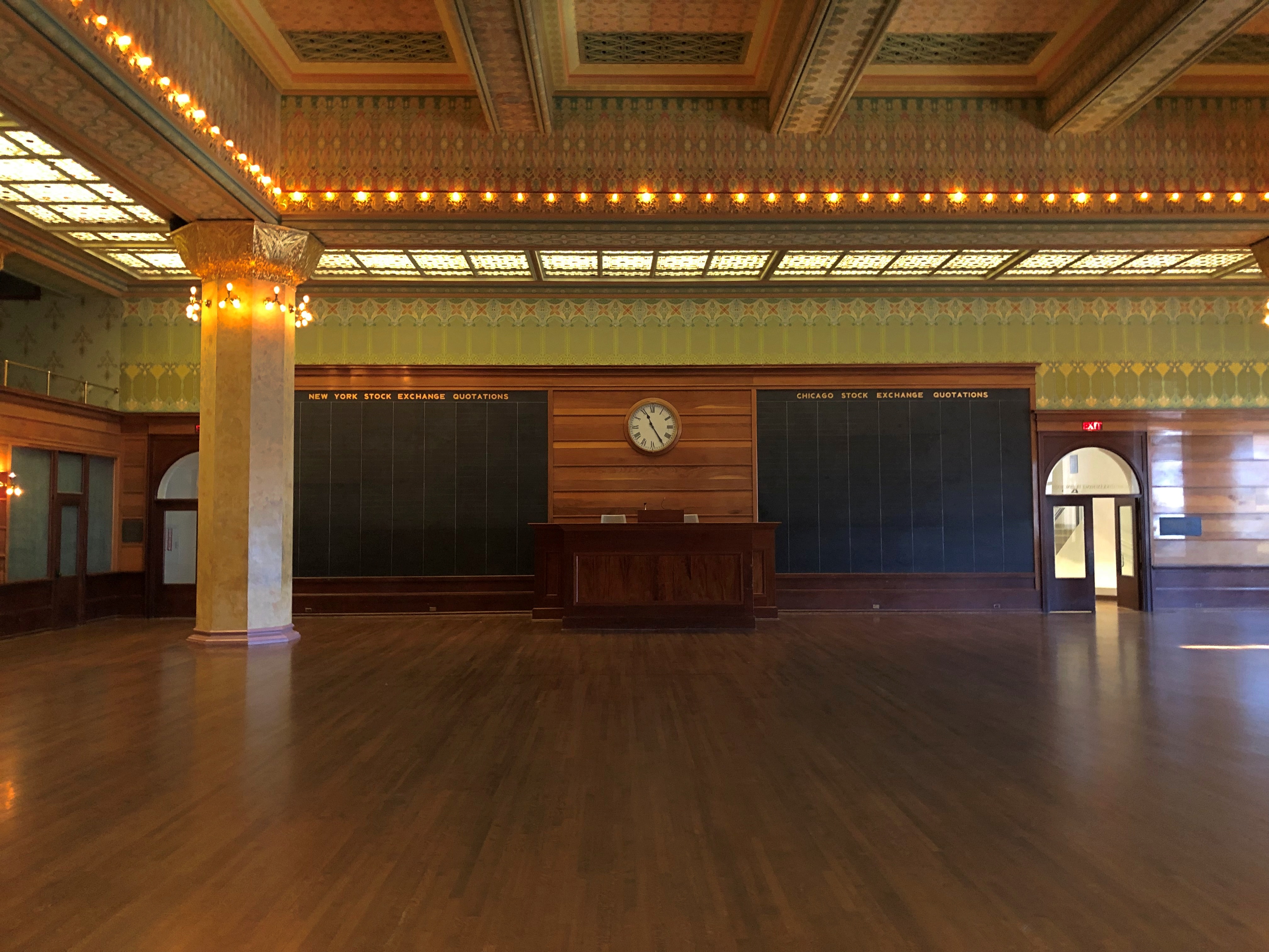
No one else was in the room with me. It is a little out of the way, in museum wayfinding terms, and it is the artwork, rather than being mere protective walls and climate control, so maybe people pass it by.
Not me. I spent a while looking at details.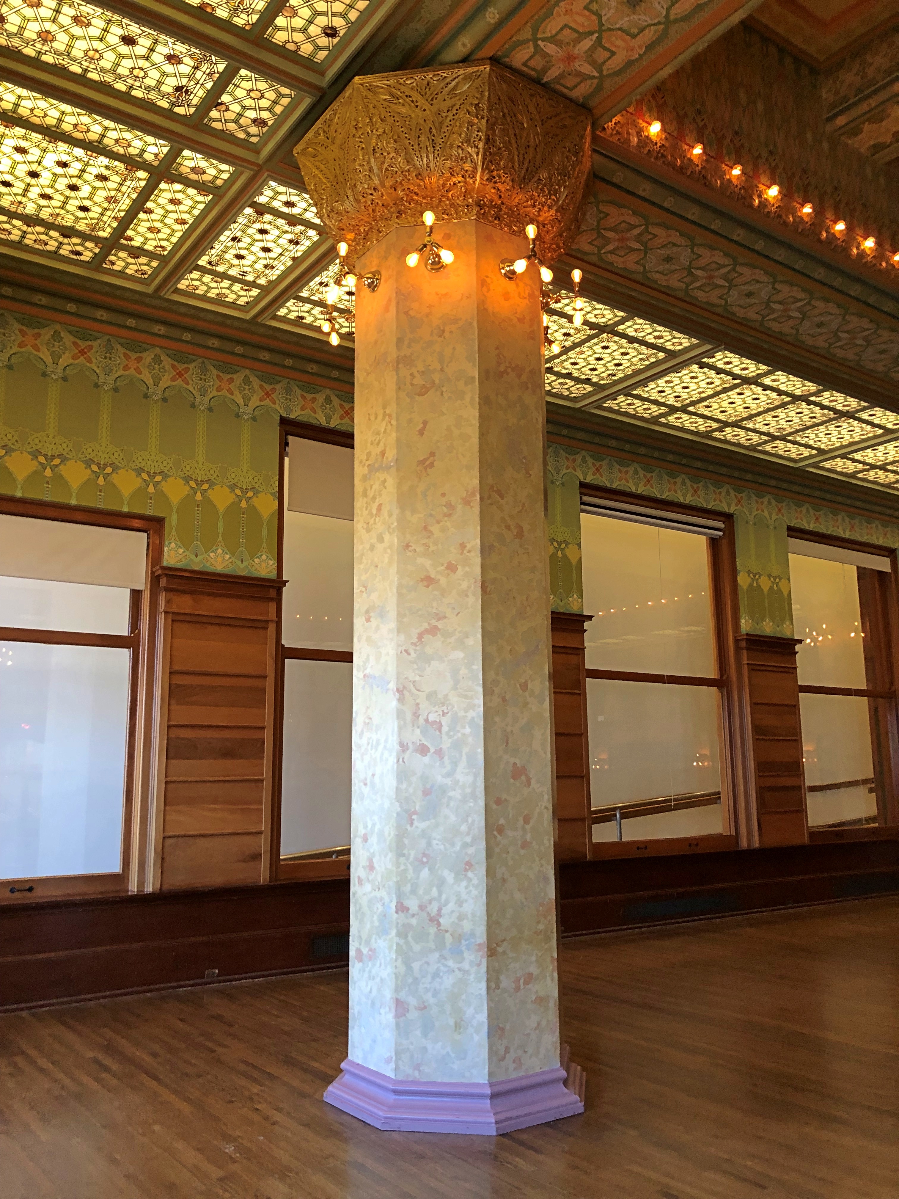
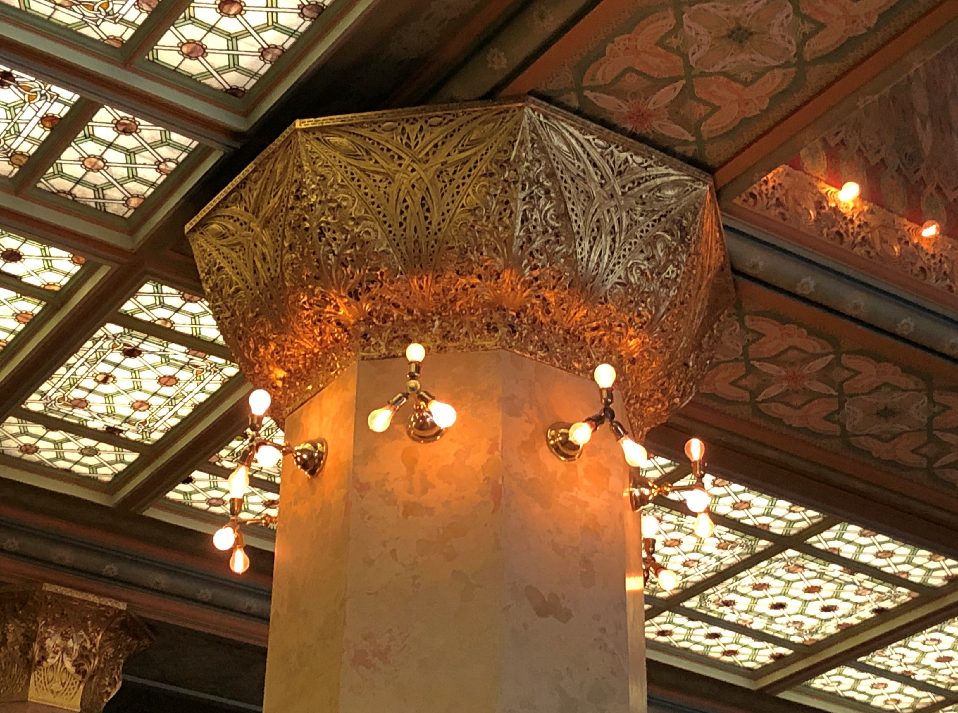
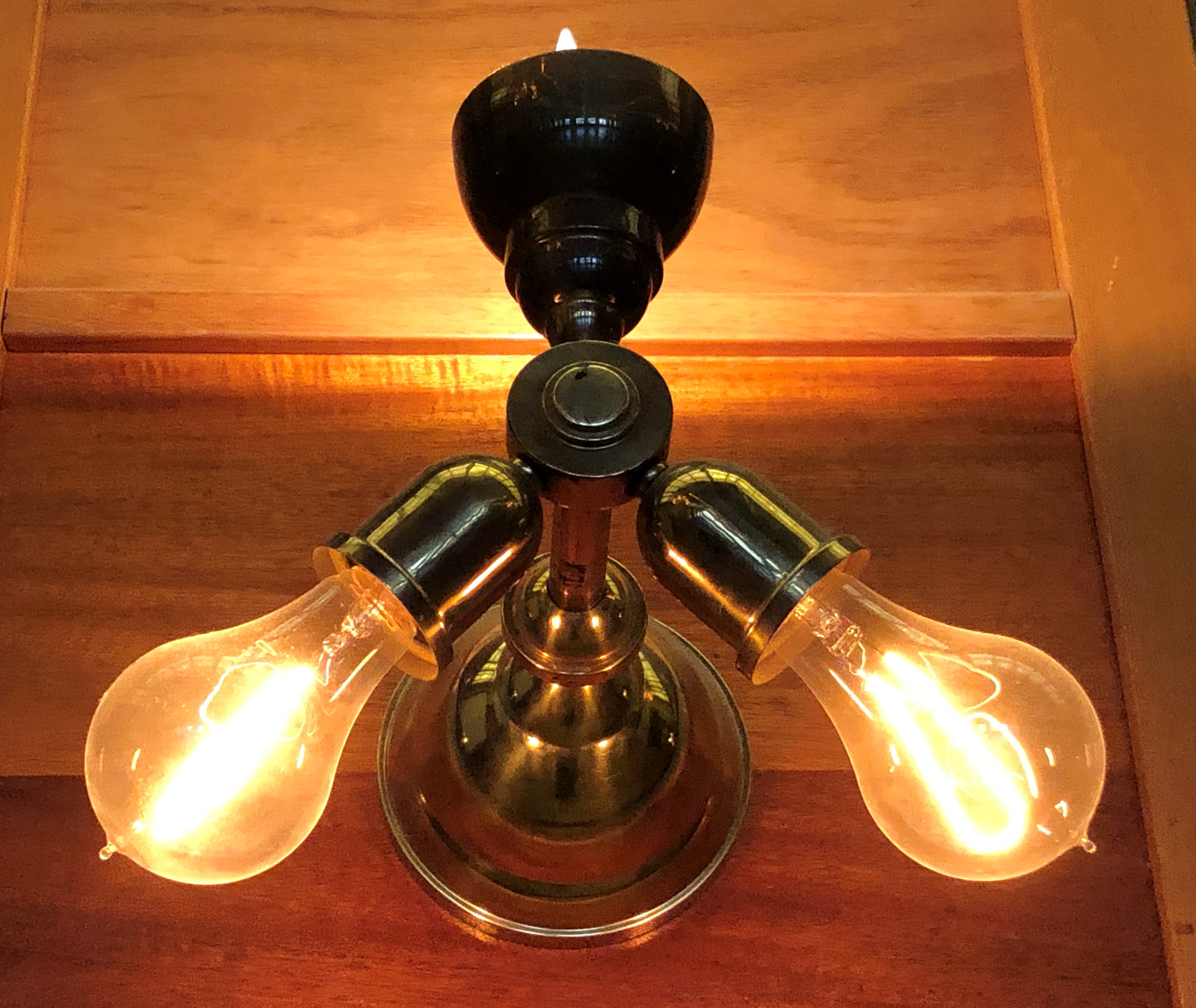
Such a grand room. Victorian ideas at work, striving to add uplift to a space devoted to grubby commerce. I’d say they succeeded.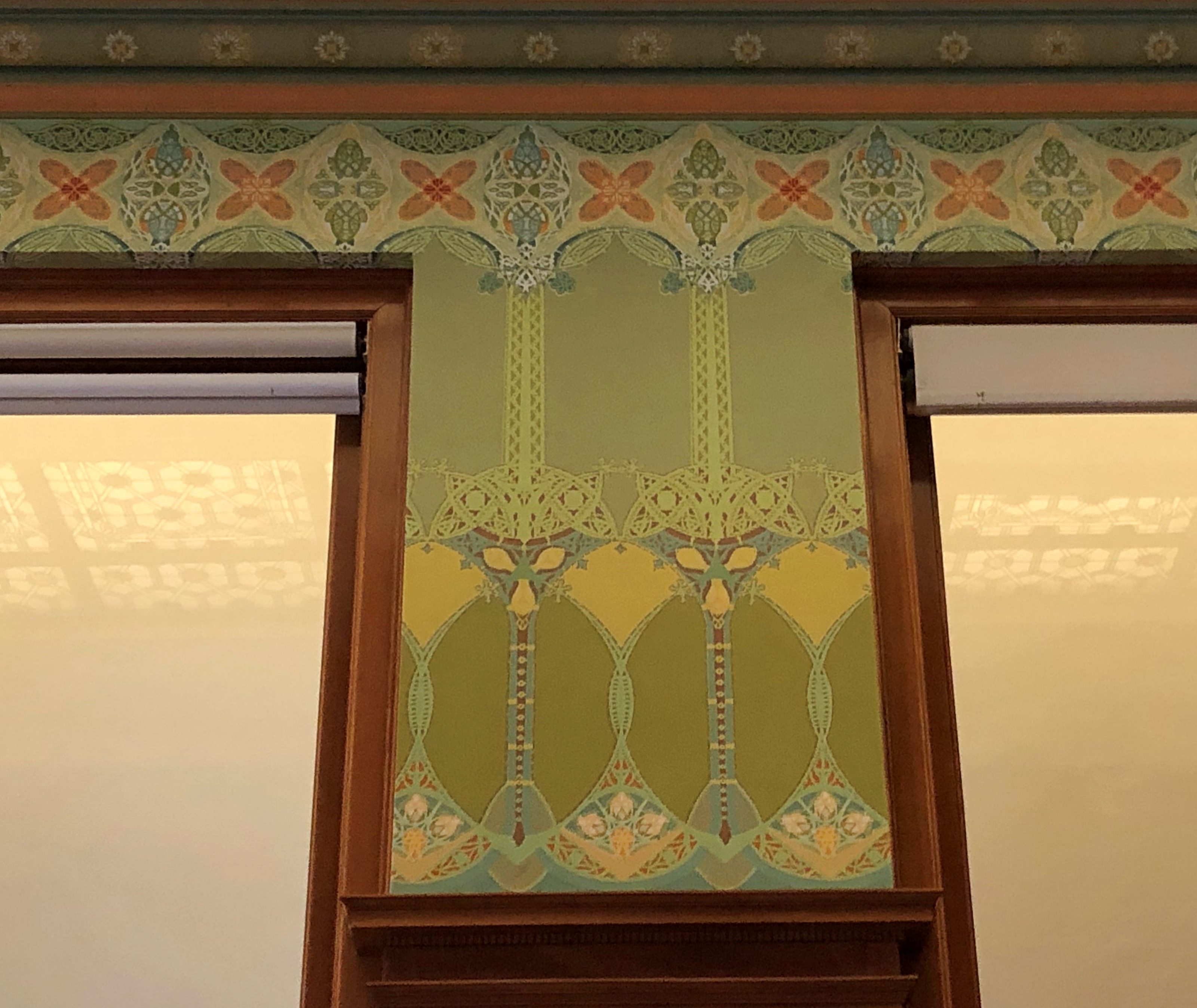
“Designed by Chicago architects Louis Sullivan and his partner, Dankmar Adler, the original Chicago Stock Exchange was completed in 1894,” the museum notes on a page that also extols the room as a place where as many as 300 people can meet.
“When it was demolished in 1972, sections of the Trading Room, including Sullivan’s elaborate stenciled decorations, molded plaster capitals, and art glass, were preserved and used in the 1976–77 reconstruction of the room here at the Art Institute.”
I attended an event there myself for some forgotten reason about 20 years ago. Suits and ties (a while ago, as I said), dresses, and drinks in hand, the room hosted such a crowd with ease. If I had 300 people to entertain, I’d certainly consider renting the place.
